I have dust in my hair, eyes, ears and over every item of clothing. A small layer adorns the entire house, I have back ache from bending in odd positions and I am so bored I'm angry. What am I doing to create such misery I hear you ask....? Sanding the god damn banisters of course. Again? I know, I KNOW.
It is the most misery inducing, relentless and un-rewarding of tasks ever known to home decorating. Fact. The kind of job that sucks you of energy but offers no rewards, no-one will ever notice that you lost actual days of your life at this callous inducing work, but everyone would notice if you didn't do it.
I realise this is more rant than post, I have no photos, I have nothing positive to say, I am in a sanding induced fury.
That's all!
Sunday, 8 January 2012

Tuesday, 3 January 2012
Happy New Year


Happy New Year from project squat!
It is with bleary eyes that I greet you on day 3 of the New Year's hangover, slowly emerging from the Christmas relaxation bubble which I happily spent with my good friends red wine and Stilton. I hope you all had a wonderful festive period and have avoided the onset of gout (maybe it's not just a hangover...!).
In keeping with this glorious time of reflection and resolutions for positive thinking I thought this the perfect opportunity to look back at the achievements of 2011, to focus on what has been done rather than what is still to do. So, folks, here are my top 10 highlights from the dust bowl (in no particular order).
1. The Live-able Living Room: Re-energised from a lovely holiday a week was devoted to getting the living room ship shape. Books shelved (colour coded of course), cushions retrieved, pictures hung. Let's casually over-look the 25 year old sofas, which are still yet to be replaced. The result was a welcoming, elegant room finally worth relaxing in.
2. The Arrival Of The Prodigal Lights: Yes it was a foolish idea in the first place, yes I was an idiot to give my credit card details to a random teenager with an American accent over Skype, yes it was a lot of hassle fighting to get them out of customs. But, when love strikes....After months of no communication from the seller, weeks in customs, days in a delivery depot and finally my local post office the arrival of the infamous Etsy lights was well worth the pain (even if they came with non usable American bulbs!)
3. Project Garden: An achievement for which I can take little/ no credit except for a quick, non thought through sweep round a garden centre. The transformation of the wasteland of a garden was a sight to behold. From barren home of barbed wire to urban paradise it has proceeded to bring much joy to BBQ lovers and smokers throughout the year.
4. There's Only One Down-Pipe: By hook or by crook down-pipe was going to get a mention. It continued to delight me with its restorative powers on two occasions. The near disaster that was 'black gloss gate' on the fireplace and the re-decoration of the slightly unloved spare room. Both episodes proved once again that this is the king of paints.
5. Loo loo Skip To My Loo: The downstairs loo had always been something of a let down, the un-even walls highlighted by the wishy washy grey and mistake of a window. A room to be avoided at all costs. UNTIL intervention came in the beautiful form of House Of Hackney wall-paper and matching dark blue wood panelling. A stroke, if I may say so myself, of genius!
6. Wine, Women (and men) And Song: Of course a house isn't a home unless you can share it with your friends. Many of ours braved it in the tough times and it has been a real pleasure to invite them back for many less dusty occasions. Despite my continual screams of 'don't touch the walls', the only damage has been inflicted by myself and an unfortunate incident involving red wine and a white wall.
7. Money, Money, Money: Enough sentimental rubbish, let's face it, what we really care about is the cash. Would we make some? well the confirmation was so gratifying I had it valued 5 times, crassness aside it was re-assuring to know it had been worth the effort.
8. Street Smart: Oh happy day it was when the curiously painted red brick 'accessories' that adorned our upstairs windows were painted over. Re-modelled wall and painting of rendering soon had the dust bowl looking like the smartest house in the street.
9. Shabby Chic: After something of a - buying, collecting, stripping, waiting a month for their return, scrubbing, sealing, lifting, floor destroying - toil we finally replaced the final two radiators. We are now happily Victorian stylee shabby throughout.
10. Heart Home: Of course one highlight shines brighter than the rest. Our appearance in Heart Home was an honour and a joy. Much fun and inspiration on the shoot and so much satisfaction seeing the results, it is from there that I take these photos. To check it out in full visit http://hearthomemag.co.uk/
That's all folks (for now). Here's to 2012 and all the carpet it may bring.
x
Thursday, 15 December 2011
The Twelve Days Of Christmas




It's about this time of year that I should regaling you with tales of innovative, crafty and oh so special Christmas decorations. Sharing the delights of my home-made mince pies and the mulled wine wafting through the house as it sits at that just right temperature 24/7, I should be demonstrating how to make a Christmas presents look beautiful with nought but an old bin bag and some twigs, all whilst the snow comes gently down and Nat King Cole croons away in the background.
My Christmas countdown has included a slightly different kind of preparations. Less coverings of snow and Christmas knits, more layers of dirt and building overalls, a distinctly dull and laborious process of stripping, dipping and sanding.
Staircase progress has been made, requiring approximately 30 minutes a spindle, it is slow, laboriously painful progress, but progress none the less. Having stripped back to the wood and painted one coat on approx three quarters of the stairs it now becomes apparent that they will all need re-sanding, re-painting, and then probably doing for a third time. I'm all about reclamation and restoration but at times like these the words 'you could just buy a new one' start to become alarmingly appealing.
As any eBay regular will know a part of its charm, is the 'danger factor!', the slight element of the unknown, the risk, it could be a total bargain, it could be a heap of s**%. The, I'm bidding, Oh God I've bid, what if I win... but I don't want a pine table to seat 12 from Cornwall, Oh damn I've won it, roller-coaster of emotions that keeps us addicts coming back for more. You never know quite what you'll get, a fireplace smashed into a thousand pieces perhaps, maybe a bath that turns out to be miniature, some doors that couldn't fit in the house unless they were cut in half and although things often aren't quite perfect, you somehow find a way to make them work.
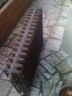
My latest purchase was no exception. I required 2 more vintage radiators for the bedroom, white would be fine, black even, or bare metal. Of course I ended up with 3 silver radiators with no feet or brackets. 2 for the bedroom, 1 for my ever expanding collection that adorns the hallway. I hate adding to the costs which somehow defeats the object of eBay but there was no choice but to send these bad boys to be dipped. They arrived back a kind of metallic, rust colour and filthy as hell. I set to with the bleach, washing them to within an inch of their lives and coating with a lacquer to prevent dirt coming off constantly.
A small amount of welding, banging, butchering floor-boards later they are in. Not to everyone's tastes I am sure but I rather like them and, they seem to work!
Wednesday, 9 November 2011
Colour Me Badd


This week's hot topic has been colour! I have been advising two people on the same issue, what colour to paint a naturally dark space - one a hallway/ living space in Bristol, the other a kids playroom in Lewes.
My gut response, predictably, go dark, go downpipe! (I'm not entirely obsessed, I do like some other colours - black, dark dark green, sludgy browny grey, but mostly downpipe), have included a few lovely images to try and indoctrinate you ( once again see the amazing @AbigailAhern.).
I am aware that not everyone is as in touch with their dark side as me (in equal measure paint and life!) hence my advise is thus:
Don't fight it: If the room is dark, no amount of painting it a light colour will change that fact. The brightest white will only be bright if it has sun to bounce of it.
Think Warm: If pale colours are your thing, then aim for a warm tone, whether it be grey or green or white choose a shade that has a pinkish hue in certain lights.
Don't get the blues: Blue shades or hints of blue... alert, alert, alert. We are talking cold.
Be Bold: To my mind bold is good, as much as I love dark, I also love bright white (in the right space) the only time I have been disappointed is when i have gone for the middle ground - a pale insipid grey, a white that came out cream. Whatever your direction take yourself that one step further than you might be inclined to go. Go on... dare you!
Think Accents: If you like dark (kind of, a bit, maybe..) but don't want to go the whole hog, what about a feature - paint the in-built furniture a dark gloss, the inside of the bookshelves, a chimney breast. Accessories can be key, all colours have their opposite which enhance their natural beauty for green, orange works really well, for grey, try yellow or pink. Now you might not want an orange wall, but a lamp? (in playroom case) some storage boxes, a piece of art? Possibly stating the obvious but if you prefer a neutral wall then some bold coloured accessories can work wonders to make the space alive and interesting, easily interchangeable and will not take over.
Try It: Face the fear folks, at the end of the day, it is only paint! As per previous post, most of you know what you like so, find some images, mood board it up, sample, sample, sample (make sure you try it on every wall, different lights will produce very different shades).
Take A Risk: If it all goes wrong, you paint over it, no biggie! (#blackglossgate).
Ignore All Of The Above: We all know what they say about rules. Best thing to do, just do it whatever the hell you like. Your personal taste is a natural filter, if you like it, it will work for you.
Wednesday, 2 November 2011
How Will I Know?


I was out for dinner last night with my lovely friend Mylene and conversation turned, as it often does, to interiors. Now Mylene has never invited me to her house (bloody cheek) but she is one of the most stylish, creative and generally fantastic women I know (she reads this blog... she bought me dinner!), so I can only assume that her home is every bit as stylish as her appearance.
She, however, feels differently, in her own words she is 'paralysed by indecision' and just doesn't know what direction she wants to take. This is something hear ALOT, along with, "I honestly don't know what I like", "I have no clue where to start on paint colours", " I don't know if I want contemporary or traditional.... minimal or eclectic, light grey or stone...".
Well my simple response to that is yes you do and no-one does. Contrary to what Mylene and others believe, when I started project squat I didn't just KNOW. Yes I had some ideas, nuggets of styles or items I wanted to include, a tile here, a paint colour there (after 5 years of painstakingly post-it noting Elle Decoration it would be tragic if I didn't). But I had no idea how it might all fit together. Until, that is, I embarked on a mood board.
See photo of my very first mood board -for the kitchen. A load of haphazardly cobbled together photos from mags, no consideration paid to how I laid them out, no more discrimination applied other than the natural filter that I liked them. A small amount of editing later and there it was a very clear theme and style which bares striking resemblance to my real life kitchen.
As I learn more about design I realise that the same process applies, albeit in a slightly more structured way.. we start with a concept (see concept for a friend's house in Lewes). Nothing here is to be taken literally but it inspires colours, textures, a mood and from there the rest flows.
So for anyone paralysed with fear, hear this. I hazard a guess that not even the most creative designer in the world 'Just knows' (well maybe Lee Broom does?!), put down that fear, pick up those magazines and get ripping.
Or employ me and I'll do it for you?
Sunday, 30 October 2011
Praise You


Slightly veering away from the normal theme of my own renovation project I can't help but comment on this beauty! I have wandered past this house many times (in a slighty more selubrious part of the hood)and gazed longingly at its majesty from the outside. Now I get to see inside I am even more awe-struck, possibly the mother of all renovations! See the rest here
http://www.guardian.co.uk/lifeandstyle/gallery/2011/oct/28/ugly-house-modernist-beauty-in-pictures#/?picture=380927890&index=4
Wednesday, 26 October 2011
Painter Man, Painter Man


OK, so here it is, please appreciate how difficult it is for me to say this, I can't even believe it myself, I mean this never happens to me, never, NEVER, I'm still a little bit in shock. Here goes, gulp .....I ... Made... A.... Mistake!
Wow, there it is. It's out there. Not just any mistake either, a mistake with colour, paint colour and paint colour is my thing! But I am a strong woman and I feel it only fair to share the error of my ways so that others may avoid the terrible situation I faced when after a weekend of relentless, tiring painting, I stood back and felt with such overwhelming certainty that I exclaimed out loud "I HATE it!".
I think the first error was abandonning grey, I know where I am with grey, we trust each other, we work well together. My foray into green (all be it grey green) was a risky strategy and I knew it. But after a number of weeks and trialling many many samples, I was sure I had found the perfect shade, a calming, olivey, muted hue that would surely induce the perfect nights sleep (we were painting the bedroom). As we started painting it felt good, not great, but good, so I thought best to perservere.
I had decided in advance that the chimney breast would be a different colour, to add depth, interest and a point of focus. This, my friends, is where it all started to crumble. I have recently become a fan of gloss paints, a wonderful light reflective, interesting, contemporary alternative to matt. I have seen many fine examples and it worked brilliantly in the downstairs loo. I love black, off-black even more and have often considered a room painted entirely in black, which I think is stunning. Similarly I've seen it work brilliantly on chimney breasts, mostly when paired with white.
Put two and two together and before you know it I have a black gloss chimney breast. Don't get me wrong, in theory I LOVE this. Moody, textured, reflective a statement of an accent. In practise, all wrong, wrong, wrong. The green looked yellow, the furniture (such as it is) went from grey to blue, Victorian somehow became 80's bachelor pad. The horror!
Clearly something had to be done and fast. There was only one thing that could save us now. After barely giving it enough time to dry out came the Downpipe (there is always a handy supply in stock). Sure enough the first coat brought an audible sigh of relief, the greens became more grey than yellow and the furniture its rightful shade, the room seemed to work harmoniously rather than having some kind of internal conflict. Once again praise be to Downpipe, the king of paint shades!
My pride won't let me post photos of 'black-gate' in full, but a few before and afters.
Subscribe to:
Posts (Atom)